The Cartier Tank: How a 1917 Design Became an Icon
Designed more than a century ago, the Cartier Tank turned an unlikely source of inspiration into one of the most recognisable shapes in watchmaking.
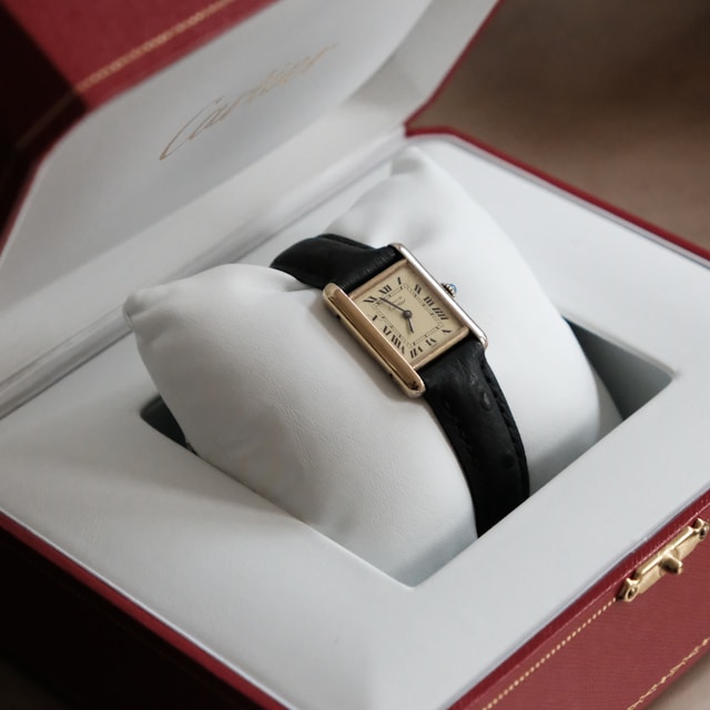
Few watches are as immediately recognisable as the Cartier Tank. Its rectangular case, Roman numerals and clean parallel lines have remained familiar for more than a century. What makes the story more unusual is where the idea came from.
The Tank was designed by Louis Cartier in 1917, during the First World War. Its name and shape were inspired by the military tanks that had become symbols of a new kind of warfare. Rather than reproducing a tank literally, Cartier translated the idea into geometry.
The central dial formed the body of the watch, while two vertical brancards ran alongside it and continued into the attachment for the strap. The result was a shape that moved naturally from a square dial into a rectangular wristwatch.
At a time when round cases dominated watchmaking, the Cartier Tank offered something fundamentally different. It was not simply a new case shape. The entire design was built around the relationship between its lines.
The watch was designed as a single form
Most watches make a clear distinction between the case and the parts that connect it to the strap. On the Cartier Tank, that separation became far less obvious.
The two parallel brancards were not simply decorative details. They defined the structure of the watch, extending beyond the dial and creating a continuous visual connection between the case and the strap.
Other elements gradually became part of the Tank's visual identity as well. Roman numerals, blued hands and a winding crown set with a cabochon helped create a design language that remains closely associated with Cartier today.
The result was remarkably restrained. There was little need for decoration because the proportions and geometry carried the design themselves.

From a watch to a cultural object
The Cartier Tank eventually became more than a design associated with watchmaking. Its appeal reached far beyond traditional watch collectors and into the worlds of art, fashion and popular culture.
That wider appeal was partly the result of its appearance. The Tank does not look like a conventional sports watch, nor does it rely on technical features to make its impression. Its proportions allow it to function almost as a piece of design rather than simply an instrument for telling the time.
Over the decades, the watch appeared on the wrists of artists, actors and public figures, helping establish it as one of Cartier's most recognisable creations. Yet its identity remained closely tied to the original idea: a simple arrangement of lines and proportions that did not require constant reinvention.
The details changed. The shape remained.
The Cartier Tank was never intended to remain a single fixed watch. Over the following decades, Cartier repeatedly adapted the original design, changing its proportions while keeping the basic visual language intact.
The Tank Cintrée appeared in 1921 with a longer, curved case, giving the original concept a more elongated profile. A year later came the Tank Louis Cartier, a model that remains closely connected to the classic form of the collection.
Later versions took the idea in different directions. The Tank Must, introduced in 1977 as part of the Must de Cartier collection, made the design accessible to a wider audience. The Tank Américaine followed in 1989, taking inspiration from the curved profile of the Cintrée.
In 1996, Cartier introduced the Tank Française. Its case and metal bracelet were designed to read more as a single integrated object, giving the Tank concept a more contemporary and architectural character.
These watches could look noticeably different from one another, yet they remained recognisably part of the same family. The proportions changed, but the underlying idea survived.
Why the original idea never disappeared
Many successful watch designs survive by changing gradually over time. The Cartier Tank followed a slightly different path. Its identity was strong enough to support change without requiring the original concept to disappear.
Cartier could lengthen the case, curve it, change the proportions or integrate it into a bracelet while retaining the visual relationship between the dial and the two vertical brancards.
That flexibility is one reason the design has lasted for so long. The Tank is recognisable without being dependent on one exact set of dimensions or a single reference.
More than a century after its creation, the essential vocabulary of the Cartier Tank remains largely unchanged. The shape still does most of the work.
More than a century later, you still know exactly what it is
A modern Cartier Tank is very different from the watch designed by Louis Cartier in 1917. Materials have changed, movements have developed and the collection has expanded into numerous forms and sizes.
Yet the original idea remains unusually easy to recognise. Two parallel brancards frame the dial, the proportions remain deliberate and the watch still feels distinct from the round cases that dominate much of traditional watchmaking.
That continuity explains much of the Cartier Tank's longevity. The design was not tied to a particular technology or purpose that eventually became obsolete. It was built around form.
More than one hundred years after its creation, the Tank remains one of the clearest examples of a watch design that has been repeatedly updated without losing its identity.
Its inspiration may have come from the machinery of war, but the result was something almost entirely different: a watch whose lasting influence came not from what it could do, but from the shape it created.